Stories are powerful. They connect an audience with people, facts, emotions and action. They help us understand difficult concepts and relationships. They help us make connections between things we wouldn’t otherwise. And we remember stories far better than we remember raw facts. Quick: list the last five vice presidents of the United States. Now tell me the basic plot of Star Wars. Which was easier?
At its best, data storytelling should leverage the power of telling a story to move an audience toward a deeper understanding — and possibly even take action — based on truth and facts. This truth may be arranged in such a way that is interesting, compelling and evokes emotion or provokes action. But it must be the truth. If it isn’t, then you could potentially still leverage the power of a story… but in a way that is exceedingly dangerous.
Here are four dangers to avoid in data storytelling:
Data Storytelling Danger #1: Missing (or Hiding) Important Context
So you’ve got a great story to tell. You’ve connected to the data source, done some analysis and come up with a great story that you’ve visualized like this:
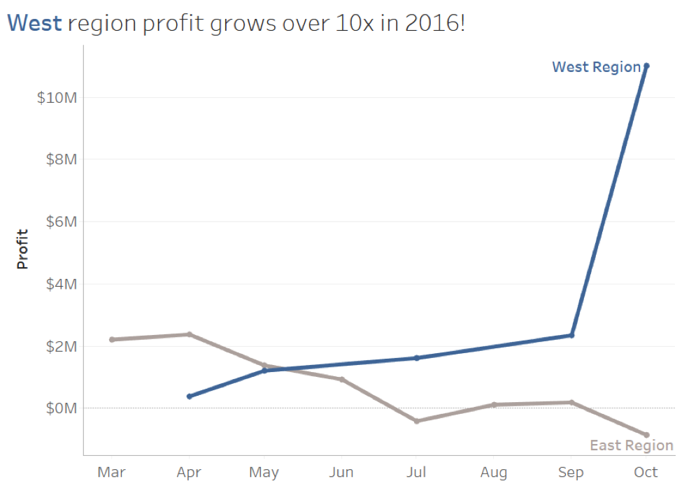
Look at that: Profits in the West region are up more than 10 times in 2016. And you’ve even done some due diligence. You’ve made sure the data passes some initial integrity checks. You’ve included the East region for reference and comparison. You didn’t use a misleading visualization. So, what did you miss?
It turns out there was a reorganization in October which combined Southwest and Central regions into the West region in that month. No wonder profits were way up! But your analysis and visualization failed to communicate that to your audience. A simple annotation, title or caption might have alerted them. And maybe it isn’t even a compelling story with that bit of context.
You’ll lose some credibility if you do this unemotionally, but you’ll lose it all if you ever do it on purpose!
Data Storytelling Danger #2: Avoid Misleading Visualizations
Here’s a compelling data story:
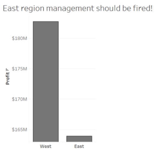
Look at the difference in profit between the West and East regions. It’s clear that the East regional management isn’t doing as good a job as the West. Maybe firing isn’t the solution, but we should at least retrain them, right?
Turns out if we visualize this correctly, that isn’t the story at all:
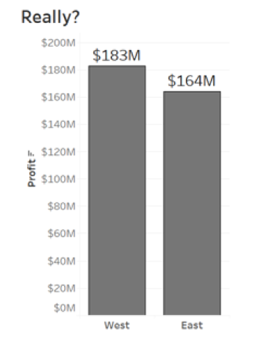
What’s the difference? In the first visualization, we truncated the axis. That is, it didn’t start at 0. Always start the axis at 0 for bar charts. Notice how misleading the results were.
But bar charts aren’t the only type of visualization that can mislead. How about the following data story?
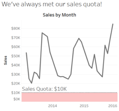
Let’s pat ourselves on the back. We’ve done so well…
… at least in every month where we actually sold something! Take a look:
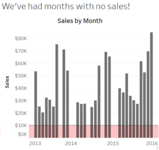
Line charts can be misleading because the lines that connect hide missing periods. So use bars or make sure your lines break for missing values. (Tableau, for example, has an option in the formatting of the measure field defining the axis.)
Data Storytelling Danger #3: Avoid Assumptions
Let’s go back to that previous chart. I’m ready to go to my boss and break the bad news – we’ve had months where we literally didn’t sell anything. I hope she doesn’t get mad!
But, of course, she does… just not for the reason I expected. She pulls up the data source and my heart skips a few beats when I see the reason for the missing months of sales:
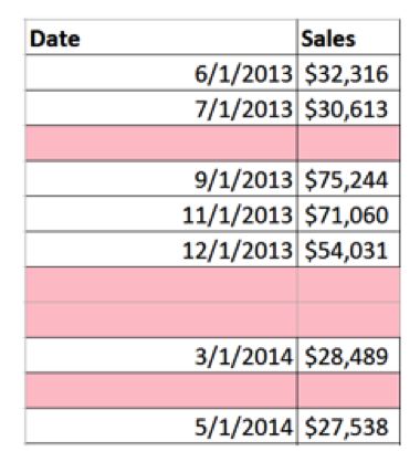
The data skips records! Maybe we did have sales in those months after all?
Question everything. Is the data complete? Is it accurate? Am I asking valid questions? Do I have all the context? Am I missing anything? Does it mean what I think it means? Never stop asking questions, either. Question the data, the prep, the analysis, the visualization, the story, the audience – everything! And don’t tell the story until you’ve made sure you are really right. (And ask others if you aren’t sure!)
Data Storytelling Danger #4: Avoid Analysis Blunders
So I noticed that the East region did poorly in terms of profit, even as the West region did great. And I think I can tell you why. Look at the following visual data story:
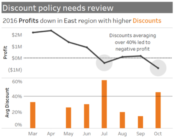
The story is great! It gives context, shows conflict (the declining profit), has a climax (the annotation and callout about discounts above 40%), and a call to action (Review the discount policy!). And it’s not a misleading visualization. No truncated axes and the bars clearly show there was no discount in April. And everything I’ve communicated is true. What did I miss?
If I spend just a bit more time on analysis and maybe even look at a scatterplot (a great way to check correlation), I’ll see this:
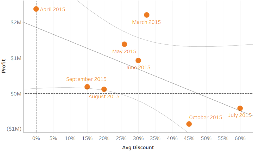
Are eight observations (of which two are the ones I call out) enough to draw a conclusion? The trend matches what I said, but those are very wide confidence bands and the p-value is .11. Statistically speaking, I’ve overstated the case in the story I’ve told (or at least told it with far more confidence than I should). It doesn’t mean there isn’t a story there, or even some cause to ask more questions about discounts.
But I need to be careful not to tell a story based on incomplete, inconclusive, or invalid analysis.
Now that you’ve been alerted to some of the dangers of data storytelling, you’ll be on your guard. Be careful to avoid these dangers and your data stories will not only be compelling and inspiring, but truthful and accurate as well.
Share:
About the Author

Joshua Miligan
Principal Consultant @ Resultant
Joshua Milligan has been recognized by Tableau as a Tableau Visionary—previously Zen Master—every year since 2014. Passionate about helping others gain insights from their data, he serves as a...
Read More


