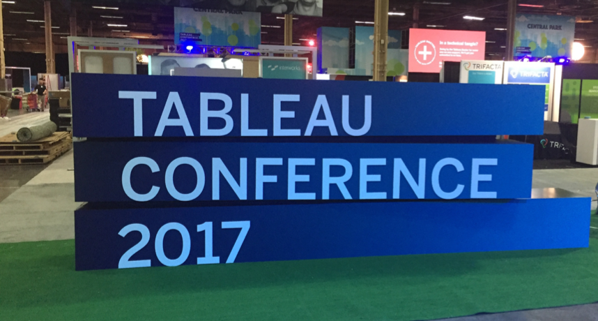
This past week was Tableau’s annual conference, and as usual, it didn’t disappoint! 15,000 data nerds descended upon Las Vegas to learn more about Tableau, data and have some fun. Read on for some of the key insights that we learned throughout the week!
#Data17Donates
Just a week before the conference, Vegas experienced the deadliest mass shooting in US history. This was a tragedy in every sense of the word, and left the city in a state of great need. Tableau decided that the best response to this was to still hold the conference, but to add an emphasis on serving the city of Las Vegas. The Tableau community came together in an amazing way, with people donating blood, serving the Vegas community and donating money. In the end, the Tableau community raised $120,536! How fantastic is that?
Product Roadmap
Tableau kicked off the conference with 2 keynotes focused on the product and company, exploring where they will go next. The features announced this year will continue to drive the product further, and enable enterprises to use it more effectively.
Tableau Desktop
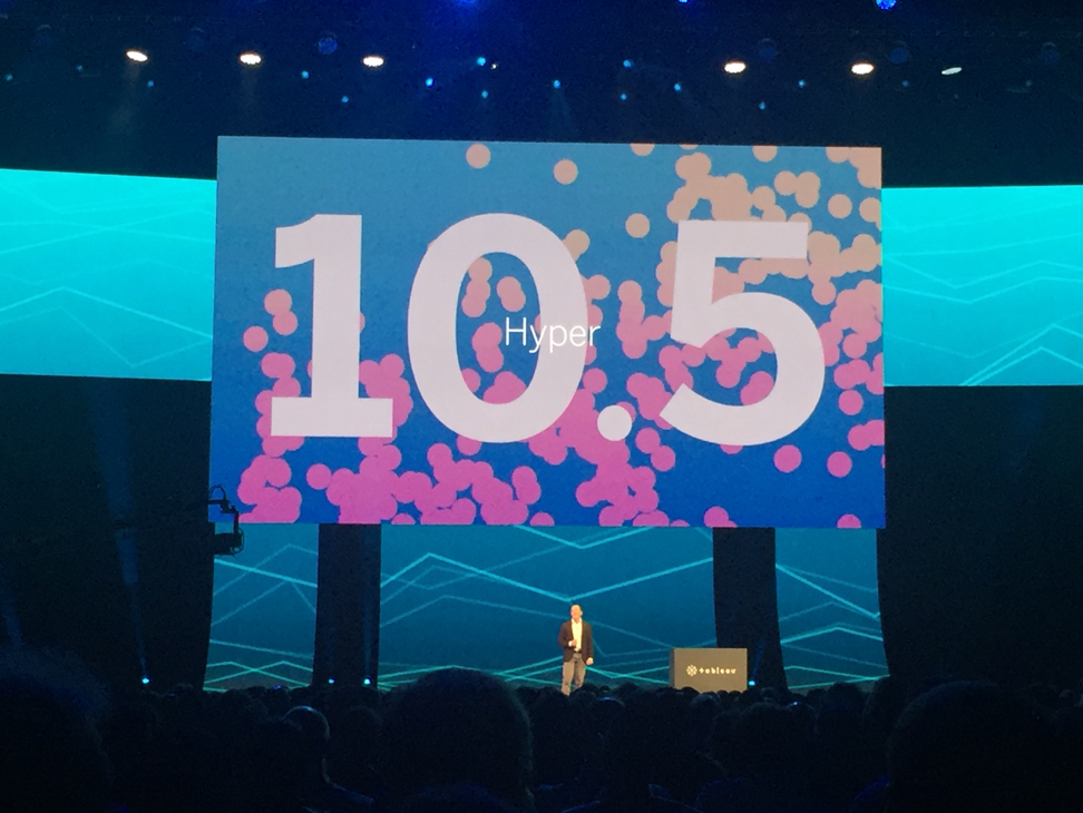
The biggest upcoming change to Tableau Desktop and Tableau Server is Hyper (#hyperhyper). Hyper originated as a database that Tableau acquired last year, and is coming in version 10.5, it will completely replace the Tableau Data Engine. This is the most anticipated change to Tableau’s product in years, as it will enable large enterprises to quickly and easily analyze hundreds of millions of rows of data. In the demo, Tableau showed Hyper perform a query in ~2 seconds that took a .tde over 30 seconds to run!
A completely new feature that was shown is the Extensions API, which will enable Tableau dashboards to become full analytical applications. I am extremely excited to see what the Tableau community dreams up with Extensions! Tableau showed an inventory dashboard where the user could actually edit the inventory amount in the dashboard – this edit gets passed back to the database, and is then reflected in the same dashboard. The Extensions API is in developer preview right now.
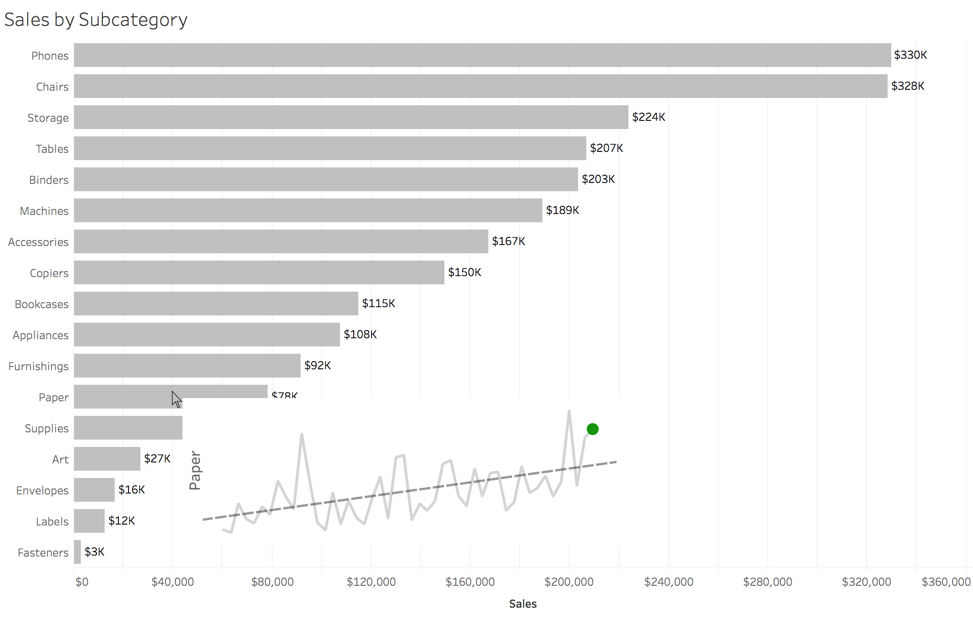
The visualization feature that I’m most excited for is Viz in Tooltip. This was initially shown at #tc15 (causing everyone to go bonkers), but didn’t make it into the product until now. My personal theory on this is that they had to overcome poor performance, which is now fixed by Hyper. Viz in Tooltip will increase the interactivity and exploration capabilities in Tableau by immediately allowing a user to see key information about the subject by simply hovering over a mark. I personally imagine that I’ll create a lot of things that look like this:
Viz in Tooltip will be available in version 10.5.
Other Visualization Features Announced
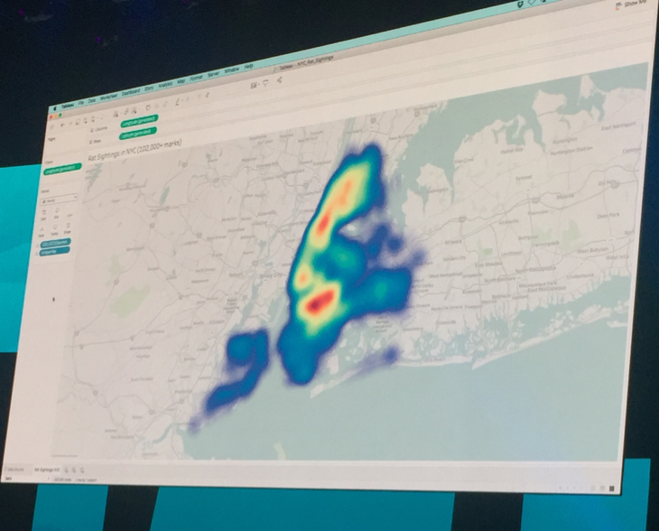
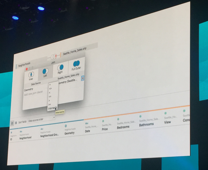
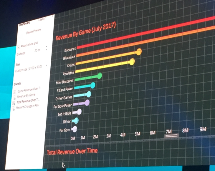
Tableau Server
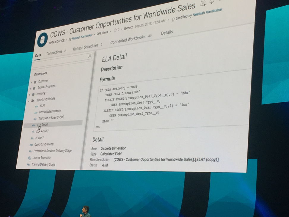
There were many changes announced to Tableau Server that made all server administrators extremely excited to upgrade to 10.5. We will finally be able to have nested projects on Tableau Server! This will enable content organization strategies much closer to what exist elsewhere in other tech industries, and will help make content more easily found on Server. Continuing with that theme of making content easier to find, they showed off certified data sources and smart table/join recommendations. These certification options are already available in 10.4.
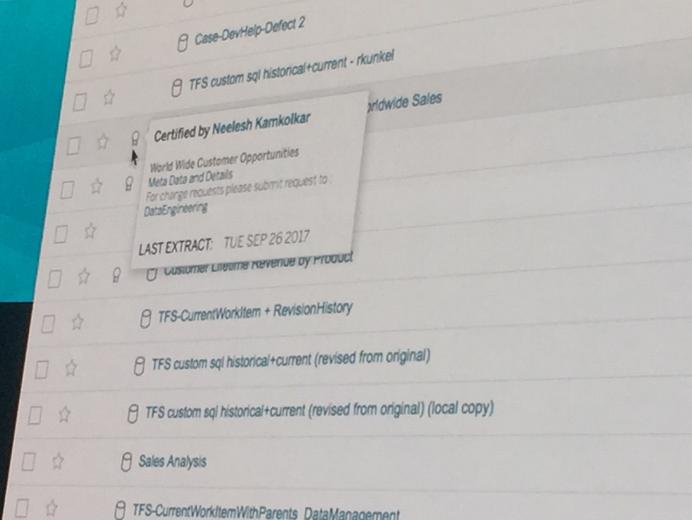
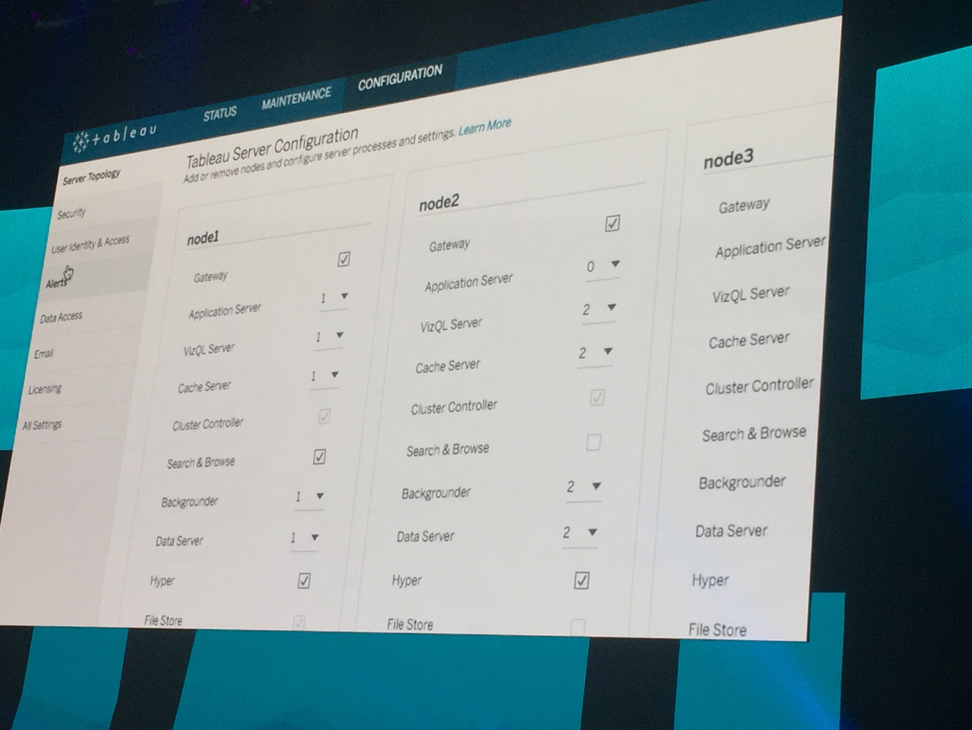
Tableau Server will also become easier to manage from a technical standpoint moving forward. This begins by being available on Linux starting in version 10.5. Additionally, a new Tableau Services Manager will enable server admins to change things like email and licensing straight from the browser. But in my opinion, the most exciting thing about the Services Manager is that you’ll now be able to scale up or down your server by adding or removing nodes from processes from the browser without starting Server. Yes, you read that correctly. You will no longer need to restart Server to add nodes! This will be available in 10.5.
Other Server Features Announced
Project Maestro
In addition to these features coming to existing Tableau products, they provided many more details about Maestro, their upcoming data preparation tool. The revolutionary aspect of Maestro is that it provides a visual and interactive means of preparing data sets for analysis. As you join data sources together, Tableau shows the profile of columns (what the most common values are), and allows you to quickly adjust what those values are. In addition, you’ll be able to quickly see which rows of data won’t perform as expected when joined.
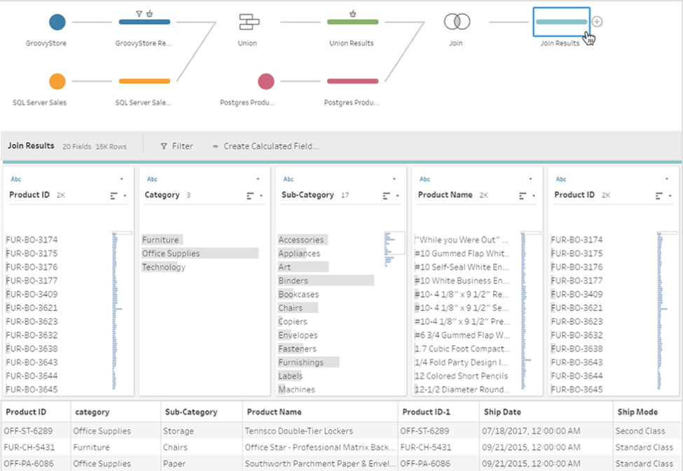
My expectation is that this visual process will result in a significantly shorter learning curve for Maestro than many other data prep tools on the market. Maestro will be in beta later this year, and all #Data17 attendees will be invited to participate. To read more about Maestro, click here.
Iron Viz
On Wednesday evening, Tableau hosted their annual Iron Viz finals. The 3 finalists were:
There were given a Zillow data set containing 150 million rows of housing data in the United States, and had 20 minutes to create dashboards.
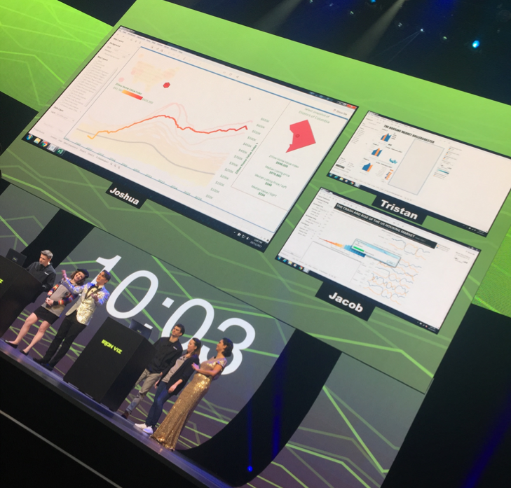
In the end, all three contestants had created beautiful and engaging dashboards that told the story of the housing bubble and crash seen in the United States. Tristan Guillevin won with a masterful dashboard and fantastic storytelling. The key features were:
These dashboards aren’t available for public viewing yet, but they will be on Tableau Public soon!
#TC18
Tableau concluded the conference by announcing that Tableau Conference 2018 will take place in New Orleans. From all of us at Resultant, thanks for a fantastic conference. We will see you in New Orleans next year!
Share: