
After a less than ideal report on some recent bloodwork, I decided it was time to start focusing on my health. My doctor had said that while my test results were not great, my relatively young age meant that some simple life changes could really improve my overall health. However, there was a problem: I had a goal (improve my health) but no system in place to track and achieve that goal.
Being heavily involved in the data world, I began to think of ways I could utilize data to create a system by which I could propel myself towards the goal of a healthier life. I knew that I needed to focus on weight, exercise and (in my case) blood pressure. These were the variables I needed to track. And if I was going to track the data, then I needed to display that data in some fashion to give me the ability to analyze my current state of health, note trends in my health data and (hopefully) help motivate me to continue my journey towards the goal of a healthier life.
In short, I needed to hack my health.
Step 1: Collecting the Data
My primary responsibility at Resultant is to deliver Tableau training to different organizations and companies across the U.S. I have seen countless ways that Tableau is being used to help companies draw insight from their data and make better business decisions based upon those insights. Why shouldn’t I do the same for myself?
I began by putting together a list of the data inputs that I would need to record:
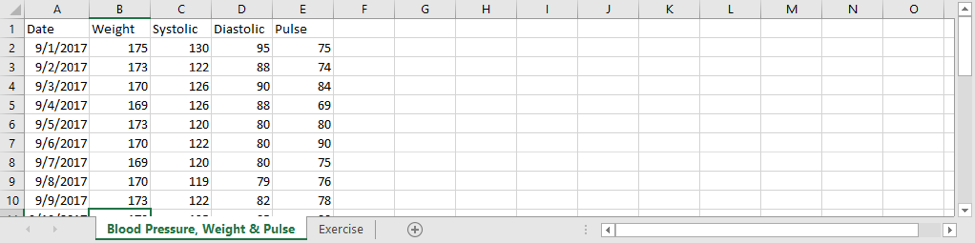
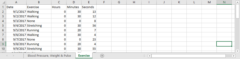
After I had identified the data points, I crafted an Excel file that I would then update with data and feed into Tableau to create my Personal Health Dashboard.
Step 2: Building the Sheets
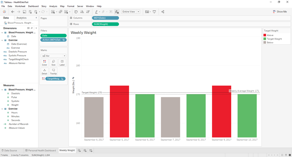
Now that my data points were set up (with dummy data at this point), I could begin to craft the appropriate sheets in Tableau. I first crafted a sheet that displayed my weekly weight data along with the average weight for that week and a target weight of 170.
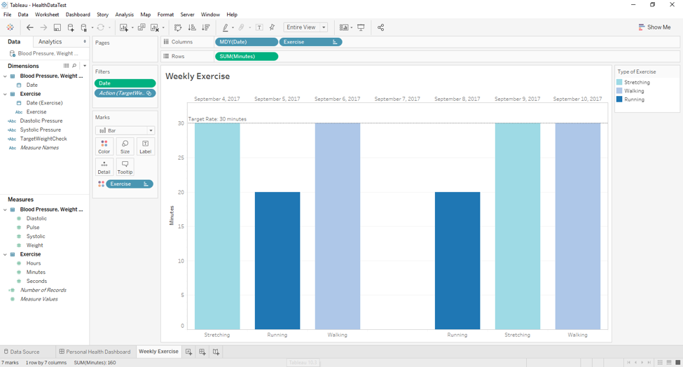
Next, I created a sheet that displayed my weekly exercise (or lack, thereof) along with a target rate of 30 minutes per day.
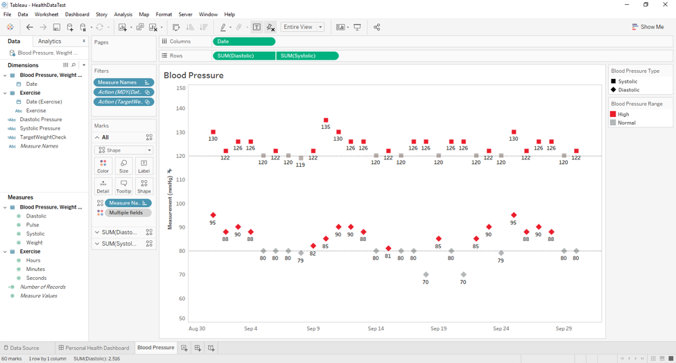
And finally, I created a sheet that displayed my blood pressure over the month with the corresponding Systolic and Diastolic values along with their respective “ideal” target ranges (120/80).
Step 3: Creating the Dashboard
Once my three sheets were created, I brought them together to create my Personal Health Dashboard.
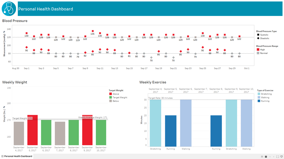
Utilizing this dashboard, I am now able to analyze overall trends in my exercise, weight and blood pressure. In the long run, I also expect to see a correlation between these data points (i.e. lower weight, lower BP) which will give me insight into how I am doing overall in my goal towards a healthier life and hopefully lead to greater motivation in pursuing this goal.
Next Steps
When it comes to health there is one thing that this first dashboard is lacking: diet information. In the next version of my Personal Health Dashboard, I will seek to incorporate this data point and expand on the features I have built into this first iteration. I would also like to transition the source file from an Excel file to a Google spreadsheet as well as utilize Tableau Server so that I can access the dashboard from a mobile platform. So, stay tuned for the next iteration!
Share:
About the Author