
I. Know They Audience
Recently, a colleague showed me a complex dashboard he had just completed. Although he was pleased that he had managed to get it working well, he felt the need to apologize by saying, “I know it’s dense and complex, but it’s what the client wanted.” Occam’s Razor encourages the simplest possible solution for any problem. For my colleague’s dashboard, the simplest solution was rather complex. This is OK! After all, that’s what his audience required. Consider the below suggestions for appropriately targeting your audience:
Greater end user expertise supports greater dashboard complexity.
If the end users want easy, at-a-glance visualizations, keep the dashboards simple. If they like deep dives, design accordingly. Often decision-makers desire at-a-glance visualizations to assist them as they decisively drive the organization. In such cases, the expertise required to know the intricacies of navigating the data should not be assumed. On the other hand, business and data analysts (and other similar roles) are more likely to possess the temperament and skillset to explore a dataset — and should be provided with an interface that allows for deeper dives.
Screen resolution and visualization complexity are proportional.
If the audience is using large, high-resolution monitors, complex dashboards may be warranted. Smaller devices, such as phones, will likely require simpler design.
Steer toward simple or esoteric chart types as needed.
Sticking with the tried-and-true formula is usually best. Presenting some esoteric chart type should normally be avoided. However, there are times to tread on the wild side! For example, maybe it’s advantageous to catch the end user’s attention through humor, such as on the Tableau 404 error page, where Sasquatch shows up in a packed bubble chart.
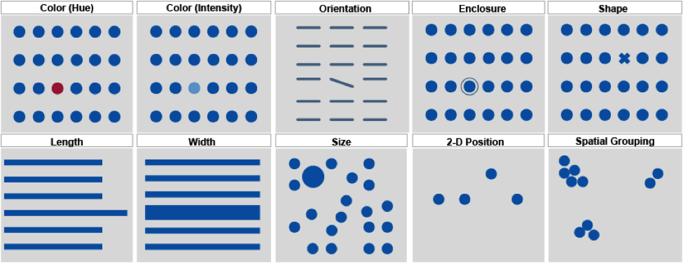
II. Thou Shalt Understand and Use Preattentive Attributes Wisely
Preattentive attributes access the sub-conscious ability to (almost) instantly garner information from an environment. For example, how long does it take you to note that the below image includes a red circle?
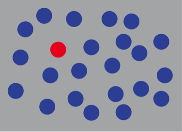
The answer is, about 0.200 seconds. In other words, the amount of time it takes for your brain to register that it’s seeing anything is the amount of time it takes to perceive the red circle. Preattentive attributes are observed before conscious thought kicks into gear. It’s worthy of another blog post to discuss preattentive attributes in detail; however, for now, we’ll wrap up this commandment by listing the primary preattentive attributes most frequently used in Tableau:
III. Thou Shalt Provide Instructions to They End User
Consider the following ideas for providing helpful instructions to your end user:
Craft titles for clear communication
Titles are important! Not just a title for a dashboard and worksheets on the dashboard, but also titles for legends, filters and other objects. These titles can be used for effective and efficient documentation. For instance, a filter in Tableau should not just read “Market.” Instead, it should say something like “Select a Market.” Note the imperative statement. The user is being told to do something, which is helpful.
Use intuitive icons
Consider a visualization presenting beer, wine and liquor sales. What icons should you use? Surely beer, wine and liquor! Why use a square, a circle and a triangle, which would cause the end user to search for the legend?
Store more extensive documentation in a tooltip associated with a help icon
A small question mark in the upper right hand corner of an application is common. This clearly communicates where to go if the end user requires additional help. In Tableau, it’s quite easy to create a worksheet comprised of only a question mark with extensive text provided in the tooltip.
IV. Thou Shalt Not Abuse Colors
These three tips should help ensure that you use colors effectively:
Keep Colors Simple and Limited
Stick to the basic hues and provide only a few (perhaps three to five) hue variations. Alberto Cairo in his book, The Functional Art: An Introduction to Information Graphics and Visualization, provides insight as to why this is important. “The limited capacity of our visual working memory helps explain why it’s not advisable to use more than four or five colors or pictograms to identify different phenomena on maps and charts.”
Respect the Psychological Implication of Colors
In Western society, there is a color vocabulary so pervasive that it’s second nature. Exit signs marking stairwell locations are red. Traffic cones are orange. Baby boys are traditionally dressed in blue, while baby girls wear pink. Similarly, in Tableau, reds and oranges should usually be associated with negative performance while blues and greens should be associated with positive performance. Using colors counterintuitively can cause confusion. Of course, designing for a non-western audience will mean observing the color vocabulary native to that culture.
Be Colorblind Friendly
Color vision deficiency impacts 8.0% of males and 0.5% of females – mostly in the red-to-green color spectrum. Thus you should avoid a red-to-green color spectrum. To understand how color-blind individuals view the world, visit http://www.vischeck.com/.
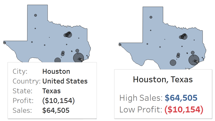
V. Thou Shalt Not Leave Tooltips at Default
By default, Tableau provides helpful information in tooltips. Unfortunately, that information is not automatically formatted in a way that invites quick and easy understanding. This is no fault of Tableau! It’s necessary for the Tableau author to adjust tooltips as needed for each visualization. Consider the below screenshot comparing pre- and post-tooltip formatting:
VI. Thou Shalt Not Stuff Thy Dashboards
There’s a temptation to try to create a single dashboard that answers every question. Resist that temptation! There is no magic bullet. Placing numerous worksheets, filters, parameters and legends on a dashboard almost inevitably leads to a confusing environment and poor performance. Instead of one “super dashboard,” create multiple dashboards, each of which addresses specific questions.
VII. Thou Shalt Use Visualization Types That Best Fit They Need
Some tire of seeing the same chart types over and over. This leads to requests such as, “Can we spice up the dashboard a bit?” Normally, such sentiments should be resisted. Introducing variety for its own sake is counterproductive. If multiple bar charts on the dashboard best meet the need, stick with the bar charts.
VIII. Thou Shalt Reduce Chart Junk
Chart junk is anything that’s not directly relevant to the data displayed in the visualization. Chart junk can include tick marks, grid lines, drop lines and banding, as well as decorative images. Sometimes, such elements can be helpful and can enable an end user to more quickly understand and better interact with a visualization. Mostly, however, chart junk gets in the way and should be removed.
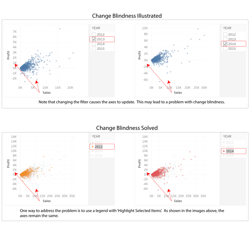
IX. Thou Shalt Battle Change Blindness
Change blindness is failure to notice changes in the environment. It usually occurs when a person is focused on one task to the exclusion of everything else. For example, consider this popular YouTube video where the viewer is asked to count the number of basketball passes made by several different people. Unexpectedly, a man dressed in a bear suit moonwalks across the court. Because of intense focus on the task at hand, the viewer is likely to miss the bear! Likewise, a crowded dashboard can cause similar issues. This is a part of the rationale behind the earlier commandment, “THOU SHALT NOT STUFF THY DASHBOARDS”. However, there are other ways to trigger change blindness as shown in the example below:
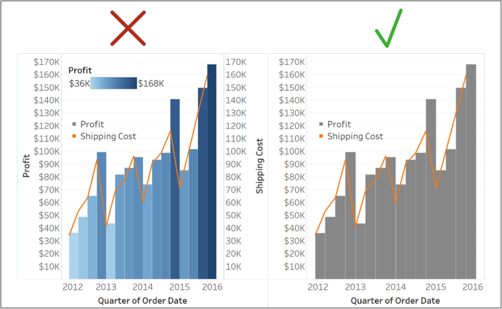
X. Thou Shalt Not Double Encode
Double encoding or redundant encoding is communicating the same information multiple times on a visualization. In the first iteration of the below visualization, profit is displayed as both colors and bars. Also, there are two axes, even though those axes are synchronized. The second iteration of the visualization corrects these problems by removing the color encoding for profit and by removing the second axis.
The above article is adapted from Mastering Tableau by David Baldwin. Mastering Tableau is available on Amazon and Barnes and Noble.
Share: